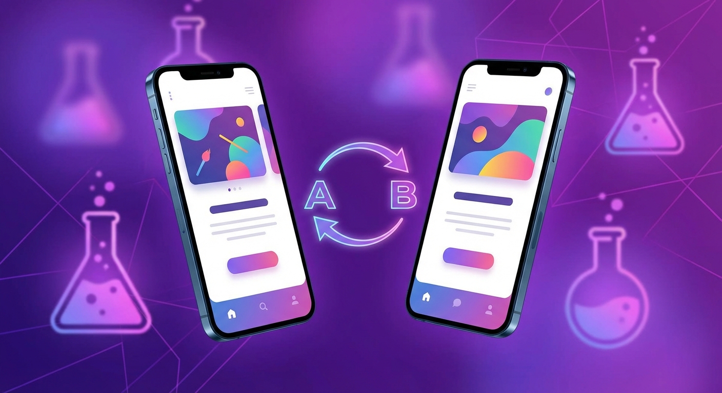
1. Why A/B testing screenshots matters
Your app store listing is the highest-leverage conversion surface in your entire mobile growth stack. It sits at the narrowest point of the funnel — every organic install must pass through it, every paid user lands on it, every search impression leads to it. And within that listing, screenshots are the single element that most influences whether a visitor taps "Get" or bounces. Research from ASO platforms consistently shows that 60% to 80% of App Store visitors never scroll past the screenshot gallery. For the majority of users, your screenshots are the entire decision surface.
Despite this, most developers design their screenshots once, upload them, and never touch them again. They rely on intuition, competitor imitation, or the preferences of whoever happened to be in the design review meeting. The result is a screenshot set that might be good — but there is no way to know, because it has never been tested against an alternative. The opportunity cost of this approach is enormous and invisible. You cannot see the installs you are not getting. You cannot feel the ranking positions you are missing. The compounding growth that a higher conversion rate would have triggered simply never materializes.
A/B testing replaces guesswork with evidence. Instead of debating whether a dark background or a light background will perform better, you show both to real users and let the data decide. Instead of assuming your hero frame headline is optimal, you test it against two alternatives and measure the difference. Every assumption you validate or reject through testing moves your listing closer to its theoretical maximum conversion rate — and because conversion rate is a ranking signal on both the App Store and Google Play, every improvement feeds back into more impressions, more installs, and more organic growth.
The conversion impact is real and measurable
Data from SplitMetrics, StoreMaven, and AppTweak consistently shows that screenshot redesigns driven by A/B testing produce conversion lifts of 15% to 40%. These are not theoretical projections — they are measured differences between a control set and a winning variant, observed in controlled experiments with real store traffic. Some of the most dramatic lifts come from changes that seem minor in isolation: swapping a feature-focused headline for a benefit-focused one, changing the background gradient, or reordering the screenshot sequence.
Consider what a 20% conversion lift means in practice. If your listing currently receives 10,000 impressions per day at a 4% conversion rate, you are generating 400 installs daily. A 20% CVR lift raises your conversion to 4.8%, producing 480 daily installs — 80 additional installs per day, or roughly 2,400 additional installs per month from the same traffic. But the impact does not stop there.
Data-driven decisions eliminate the loudest-voice problem
In the absence of testing data, screenshot decisions default to whoever has the strongest opinion in the room. The CEO prefers blue backgrounds. The designer thinks frameless looks more modern. The marketing lead insists on leading with social proof. These are all valid hypotheses — but without testing, the winner is determined by organizational politics rather than user behavior. A/B testing democratizes the decision. The data speaks, and the argument ends. This saves time, reduces internal friction, and produces better outcomes because the user — not the highest-paid person in the room — decides what works.
Compound gains create exponential growth
The most powerful argument for A/B testing is the compounding effect. A single test that lifts conversion by 10% is valuable. But a testing program that runs four tests per year, each producing a 5-10% lift, creates multiplicative growth. After four successful tests with an average 7% lift each, your cumulative improvement is not 28% — it is 31% (1.07 x 1.07 x 1.07 x 1.07 = 1.31). And because each conversion improvement lifts your keyword rankings, the impression volume grows alongside the conversion rate, creating a double compounding effect. After a year of consistent testing, apps routinely see 50-100% more organic installs than their pre-testing baseline.
Compounding gains example
| Quarter | Test result | Cumulative CVR lift | Daily installs (from 400 baseline) |
|---|---|---|---|
| Q1 | +8% CVR from hero headline test | +8% | 432 |
| Q2 | +6% CVR from background color test | +14.5% | 458 |
| Q3 | +5% CVR from screenshot order test | +20.2% | 481 |
| Q4 | +7% CVR from social proof frame test | +28.6% | 514 |
This table shows only the direct CVR effect. When ranking improvements from higher conversion are factored in, impression volume typically grows 15-30% alongside the CVR gains, pushing the real-world install increase to 50-70% above baseline by year-end.
Key insight
A/B testing is not an advanced optimization technique reserved for large teams. It is a fundamental growth practice. Both Apple and Google provide free, built-in testing tools. The only cost is the time to create variant assets and the patience to wait for results. The upside is measurable, compounding, and permanent — every winning test raises your conversion floor permanently.
2. Apple Product Page Optimization (PPO) walkthrough
Apple introduced Product Page Optimization (PPO) as the native A/B testing framework for the App Store. PPO lets you test up to three treatment variants against your original (control) product page, measuring the impact on conversion rate with real App Store traffic. This is the most reliable way to measure screenshot performance on iOS because it runs within the App Store itself, using actual user behavior under real-world conditions.
Step-by-step PPO setup
Follow these steps to configure and launch a screenshot A/B test using Apple Product Page Optimization:
- 01 Open App Store Connect and navigate to your app. Go to the "Product Page Optimization" section under the "Features" tab. You must have the Admin, App Manager, or Marketing role to create tests.
- 02 Create a new test. Click "Create Test" and give it a descriptive name (e.g., "Hero Headline Benefit vs. Feature — Jan 2026"). Good naming conventions make it easy to review historical tests later.
- 03 Add treatment variants. You can add up to 3 treatments that will be tested against your original (control) listing. Each treatment can have different screenshots, app previews, and/or promotional text. For a focused screenshot test, change only the screenshots and keep everything else identical to the control.
- 04 Upload your variant screenshot sets. Each treatment needs a complete set of screenshots for every device size you support. Ensure that each treatment differs from the control in exactly one way — one variable per test is the foundation of valid experimentation.
- 05 Set the traffic allocation. Choose what percentage of your organic traffic sees the treatments vs. the control. Apple distributes traffic evenly across all active variants. For example, with one control and two treatments at 100% allocation, each variant gets roughly 33% of traffic. You can reduce the treatment allocation if you want to limit exposure to untested variants.
- 06 Choose localization scope. You can run the test for specific localizations or all of them. If you are testing English-language screenshots, limit the test to English-speaking locales to avoid noise from users who cannot read the headline text.
- 07 Submit for review and launch. Treatment variants go through App Review before they can be shown to users. Once approved, the test begins automatically. Apple recommends running tests for at least 7 days, but most tests need 14-28 days to reach meaningful confidence levels unless your app has very high traffic.
- 08 Monitor results in App Analytics. App Store Connect displays the conversion rate for each variant, the improvement percentage relative to the control, and a confidence indicator. Wait until the confidence level reaches at least 90% before making a decision.
- 09 Apply the winner. If a treatment outperforms the control with sufficient confidence, you can apply it to your listing with a single click. The winning variant becomes your new default product page. If no treatment wins, keep the control and plan your next test.
PPO constraints to know
- You can only run one PPO test at a time. Plan your testing roadmap sequentially. Do not try to test multiple variables simultaneously — this is both technically prevented and methodologically unsound.
- Treatment variants require App Review. Budget 24-48 hours for review approval before your test goes live. Factor this into your testing timeline.
- PPO only tests organic App Store traffic. Users arriving via paid campaigns, direct links, or web referrals are not included in the experiment. This is actually beneficial — it gives you a clean read on organic conversion without paid traffic confounding the results.
- Screenshots in search results are included. On iOS, the first three portrait screenshots appear directly in search results. PPO variants affect these search-result thumbnails, so your test measures the full impact — both the search-result impression and the product page conversion.
PPO quick reference
3. Google Play Store Listing Experiments
Google Play Console has offered built-in A/B testing for store listings longer than Apple has, and the feature is more mature in several respects. Store Listing Experiments let you test graphics (screenshots, feature graphic, icon), descriptions, and even short descriptions against your live listing. For screenshot testing specifically, graphics experiments are what you want.
Step-by-step setup for graphics experiments
- 01 Open Google Play Console and navigate to your app. Go to Grow > Store listing experiments in the left sidebar. This section is available to all developers with published apps.
- 02 Click "Create experiment" and select the experiment type. Choose "Default graphics" to test your main store listing screenshots. You can also test custom store listings if you have them configured.
- 03 Name your experiment descriptively. Use a naming convention that includes the variable being tested and the date — for example, "Dark vs. Light Background Screenshots — Jan 2026." This makes historical analysis much easier.
- 04 Upload your variant screenshot set. Add a new variant and upload the alternative screenshot set. Your current live screenshots serve as the control. As with Apple PPO, ensure the variant differs in exactly one dimension — do not change the hero headline and the background color simultaneously.
- 05 Configure the traffic split. Google defaults to a 50/50 split between control and variant. You can adjust this ratio, but 50/50 gives you the fastest path to statistical significance. If you are risk-averse about showing an untested variant to half your users, you can use 90/10 (90% control, 10% variant) — but expect the test to take much longer to reach significance.
- 06 Launch the experiment. Unlike Apple PPO, Google Play experiments do not require a separate review process. Your experiment goes live immediately after creation. Google begins splitting traffic and collecting data right away.
- 07 Wait for statistical significance. Google Play Console displays the performance difference between variants along with confidence intervals. The console will indicate when results have reached significance. Do not stop the experiment early — let it run for at least 7 full days to account for day-of-week variation in user behavior.
- 08 Apply the winner or retain the control. If the variant wins with 90%+ confidence, apply it to your live listing. If the result is inconclusive or the control wins, end the experiment and keep your current screenshots. Either outcome is valuable data.
Google Play experiment metrics
Google Play experiments measure two primary metrics:
- First-time installers (Install Rate): The percentage of store listing visitors who install your app for the first time. This is your primary success metric. A screenshot change that increases the install rate is a clear winner.
- Store listing visitors (Retained users who visit): If your experiment includes changes to the first screenshot (which is visible in search results), this metric tells you whether the change affects how many users tap through to your full listing page. An increase in store listing visitors means your variant is more compelling at the thumbnail level.
Advantages over Apple PPO
- No review process required. Experiments go live immediately, saving 24-48 hours compared to Apple's review-gated PPO workflow.
- Flexible traffic allocation. You can set any split ratio, from 50/50 to 95/5, giving you more control over how much traffic sees the untested variant.
- Test multiple asset types simultaneously. You can run separate experiments for graphics, descriptions, and icons at the same time, though for screenshot testing you should isolate graphics experiments to avoid confounding variables.
Google Play experiments quick reference
Pro tip
If your app is on both iOS and Android, run your experiments on Google Play first. The lack of a review requirement and the immediate traffic allocation mean you can get results faster. Once you have validated a winning concept on Google Play, adapt and test the same concept on Apple PPO with higher confidence that it will perform well — reducing wasted testing cycles on the slower platform.
4. What variables to test first
Not all screenshot changes produce equal impact. Some variables — like the hero frame headline — can swing conversion by 15% or more. Others — like a subtle change to the caption font weight — may produce differences too small to detect at typical traffic levels. Testing the right variables in the right order is what separates effective experimentation from random iteration.
The principle is simple: test the elements that the most users see first, and the elements that create the largest visual or messaging difference. Your first screenshot is seen by every listing visitor. Your seventh screenshot is seen by fewer than 10%. Start with what matters most.
Priority-ranked test variables
| Priority | Variable | Hypothesis | Expected impact |
|---|---|---|---|
| P0 | Hero frame headline | Benefit-focused copy ("Save 3 hours/week") outperforms feature-focused copy ("Smart scheduling engine") | 10-25% CVR lift |
| P0 | Background color / style | Dark gradients convey premium quality and stand out in the store's light-mode browse | 5-20% CVR lift |
| P1 | Device framing vs. frameless | Device frames add context and familiarity; frameless designs maximize visible UI area | 5-15% CVR lift |
| P1 | Screenshot order | Leading with the highest-value feature vs. following a user-journey narrative sequence | 5-15% CVR lift |
| P2 | Social proof placement | Showing ratings/awards on frame 2 (high visibility) vs. frame 6+ (lower visibility) | 3-10% CVR lift |
| P2 | Feature sequence | Ordering features by user research priority vs. alphabetically or by internal product roadmap | 3-10% CVR lift |
| P3 | Caption font size and style | Larger, bolder captions improve thumbnail readability and scanning speed | 2-8% CVR lift |
| P3 | Number of screenshots | Full set of 10 (iOS) or 8 (Android) vs. a curated set of 5-6 high-quality frames | 1-5% CVR lift |
Deep dive on each variable
Hero frame headline: This is the single highest-impact element to test because it appears on every impression — both in search results and on the product page. The headline of your first screenshot is often the only text a browsing user reads before deciding to install or move on. Test benefit-oriented copy ("Track habits and build streaks in 30 seconds") against feature-oriented copy ("Smart habit tracker with reminders"). Test outcome-focused messaging ("Get fit in 10 minutes a day") against process-focused messaging ("AI-powered workout planner"). Test short, punchy headlines (3-5 words) against longer, more descriptive ones (8-12 words). The differences are frequently substantial — 10% to 25% conversion swings on the hero headline alone are well-documented.
Background color and style: The background of your screenshot set is the first thing users register visually — before they read any text. Dark backgrounds tend to convey premium quality and stand out in the App Store's light-mode interface. Bright, saturated backgrounds grab attention in crowded search results. Gradients add depth and visual interest. Test your brand color against a contrasting palette. Test solid backgrounds against gradients. Test dark mode against light mode. Color changes are easy to implement and often produce surprisingly large conversion differences because they affect the emotional first impression before any conscious evaluation occurs.
Device framing vs. frameless: Device frames (showing your app inside an iPhone or Android phone mockup) provide context — they tell the user "this is what the app looks like on your phone." Frameless designs (showing the app UI full-bleed without a device mockup) maximize the visible area of your app's interface, letting users see more detail. The winner varies by category and audience. Productivity apps and business tools often benefit from device frames because they add professionalism. Games and creative apps sometimes perform better frameless because the visual content speaks for itself. The only way to know for your app is to test it.
Screenshot order: The sequence in which your screenshots appear shapes the user's experience of your listing. Leading with your strongest feature puts your best foot forward immediately. A narrative sequence (onboarding flow, then core features, then advanced capabilities) tells a story that builds interest. Some apps find that leading with social proof (a frame showing ratings, awards, or press mentions) sets a trust foundation that improves engagement with subsequent frames. Test at least two different orderings to find what your audience responds to.
Social proof placement: Showing star ratings ("4.8 stars from 50,000 reviews"), download milestones ("Trusted by 2M users"), or press quotes ("Best Productivity App — TechCrunch") can substantially boost conversion — but where you place this information matters. Early placement (frame 2) ensures maximum visibility. Late placement (frame 6+) targets users who have already shown interest by scrolling deep into your gallery. Test both positions to determine which produces a higher overall conversion rate.
Testing priority rule
Always test P0 variables before P1, and P1 before P2. A hero headline test that produces a 15% lift is worth more than five P3 tests combined. Resist the temptation to test subtle refinements before you have validated the big structural decisions. The big wins come from big changes — test boldly, especially in your first few experiments.
5. Designing valid experiments
An A/B test is only useful if it produces trustworthy results. A test that runs too short, changes too many variables at once, or launches during a seasonal anomaly produces data you cannot act on with confidence. Experimental rigor is what separates actionable insights from misleading noise. This section covers the principles that ensure your screenshot tests produce results you can trust and act on.
One variable at a time
The most fundamental rule of A/B testing is isolation. If your variant changes the hero headline and the background color and the device framing simultaneously, and it wins, you have no idea which change drove the improvement. Was it the headline? The color? The framing? All three? The interaction between them? You cannot know. This means you cannot build on the insight in future tests — you have to re-test each variable individually anyway.
Change exactly one thing per test. If you want to test a new headline, keep the background, framing, and layout identical to the control. If you want to test a dark background against a light one, keep the headline text, device framing, and screenshot order the same. This discipline is tedious but essential. It is the only way to build a reliable understanding of what your audience responds to.
The one exception is when you are doing a complete redesign test — comparing a fully new screenshot set against the current one. This is a valid test that answers the question "is the new set better overall?" But it does not tell you why. Use full-redesign tests as a first pass, then follow up with targeted single-variable tests to understand the individual drivers.
Minimum sample sizes and test durations
Statistical significance requires sufficient data. The amount of data you need depends on two factors: your traffic volume and the size of the effect you are trying to detect. Large effects (20%+ conversion difference) are detectable with less data. Small effects (3-5% difference) require substantially more data.
| Daily listing views | Detectable effect size | Minimum test duration | Recommended duration |
|---|---|---|---|
| 50,000+ | 2-3% CVR difference | 3-5 days | 7 days |
| 10,000-50,000 | 5-8% CVR difference | 5-7 days | 14 days |
| 1,000-10,000 | 10-15% CVR difference | 7-14 days | 21 days |
| 500-1,000 | 15-25% CVR difference | 14-21 days | 28 days |
| Under 500 | 25%+ CVR difference only | 21-28 days | 28-42 days |
The "recommended duration" column includes padding to account for day-of-week effects and ensure the test covers at least one full weekly cycle. Never run a test for fewer than 7 days, regardless of traffic volume, because user behavior varies systematically between weekdays and weekends. A test that runs Monday through Thursday may show different results than one that includes a full weekend.
Statistical significance thresholds
Both Apple PPO and Google Play experiments report confidence levels. The standard threshold for acting on a result is 90% confidence, meaning there is a 90% probability that the observed difference is real and not due to random chance. Some practitioners use 95% for high-stakes decisions.
Here is how to interpret different confidence levels:
- 95%+ confidence: Strong evidence. Apply the winner with high certainty. The probability of the result being due to chance is less than 5%.
- 90-95% confidence: Good evidence. Apply the winner, especially if the measured lift is large (10%+). Consider re-testing if the lift is small and the decision is high-stakes.
- 70-90% confidence: Suggestive but not conclusive. The data leans in one direction but has not crossed the significance threshold. Extend the test if possible. If you must decide now, apply the variant only if the measured lift is substantial (15%+). Otherwise, keep the control.
- Below 70% confidence: Inconclusive. The difference is within the range of normal random variation. Keep the control. The test has answered a question — the two variants perform similarly. Move on to testing a different, bolder change that is more likely to produce a detectable effect.
Avoiding seasonal and external bias
Conversion rates fluctuate due to factors outside your control. Seasonal events (holidays, back-to-school, New Year's resolutions), competitor actions (a competitor launches a viral campaign), and store algorithm changes can all shift your baseline conversion rate during the test period. To minimize bias:
- Avoid launching tests during major holidays or events that are likely to change user behavior. Black Friday, Christmas week, and major cultural events in your target markets create abnormal traffic patterns. Test results from these periods are not generalizable to normal traffic.
- Do not launch paid campaigns during a test. If you start or stop a paid acquisition campaign while an A/B test is running, the traffic mix changes. Paid users have different conversion behavior than organic users, and even though PPO only measures organic traffic, paid campaigns can shift your ranking and impression volume in ways that contaminate the test.
- Do not update other listing elements during the test. If you change your app title, icon, or description while a screenshot test is running, you have introduced additional variables that make the screenshot comparison unreliable. Freeze all other listing elements for the duration of the test.
- Do not release a major app update mid-test. A significant new version with new features or a changed icon can alter user perception and conversion behavior across all variants, distorting the comparison.
Experiment validity checklist
- Only one variable changed between control and variant
- Test will run for a minimum of 7 full days
- No major holidays or events during the test window
- No paid campaigns being started or stopped
- No other listing elements being changed simultaneously
- No major app update scheduled during the test period
- Decision threshold defined before launch (90% or 95% confidence)
- Baseline metrics recorded for at least 14 days before the test
6. Interpreting results and making decisions
Running the test is the easy part. The harder discipline is reading the results correctly and making sound decisions based on what the data actually tells you — not what you hoped it would tell you. The goal of every test is to increase your understanding of your audience, not just to declare a winner. Even inconclusive tests and losing variants generate valuable insight when analyzed properly.
Reading confidence intervals
Both Apple PPO and Google Play experiments report results as a point estimate with a confidence interval. For example, you might see: "Variant B conversion rate is 6.2% higher than control, with a 90% confidence interval of [+2.1%, +10.3%]." This means the data suggests Variant B is better, and the true improvement is most likely between 2.1% and 10.3%. The wider the interval, the less precise your estimate — which usually means you need more data.
Key interpretation rules:
- If the entire confidence interval is above zero: The variant is likely better. The confidence level tells you how sure you can be. At 90%+ confidence with the entire interval positive, apply the variant.
- If the confidence interval spans zero (e.g., [-3%, +8%]): The result is inconclusive. The variant might be better or worse — the data cannot distinguish. Keep the control and plan a bolder variant for the next test.
- If the entire confidence interval is below zero: The variant is performing worse than the control. End the test and revert to your original screenshots. This is a valuable finding — you now know what does not work for your audience.
When to apply winners
Apply a winning variant to your live listing when all of the following conditions are met:
- 01 Confidence level has reached your pre-defined threshold (90% minimum, 95% preferred for high-stakes decisions).
- 02 The test has run for at least 7 full days, covering a complete weekly cycle to account for day-of-week variation.
- 03 No external confounding events occurred during the test period (no major holidays, no campaign launches, no viral press coverage).
- 04 The improvement is practically significant, not just statistically significant. A 0.5% conversion lift at 95% confidence is real, but it might not be worth the operational effort of maintaining a new screenshot set. Focus on wins that meaningfully move the needle.
When to keep the control
Keep your current screenshots (the control) when:
- The result is inconclusive. No clear winner means no reason to change. The existing screenshots have a proven track record — do not replace them with something that has not demonstrated superiority.
- The variant lost. If the control outperforms the variant, you have confirmed that your current approach is better — at least for the variable you tested. This is valuable information, not a failure.
- External events compromised the test. If a viral event, algorithm change, or competitor action occurred mid-test and clearly affected the results, discard the data and re-run the test during a clean period.
Documenting results: building a test playbook
Every test, whether it produces a winner, a loser, or an inconclusive result, should be documented in a structured format. Over time, this documentation becomes your most valuable optimization asset — a playbook of validated and invalidated hypotheses specific to your app, your audience, and your category.
Test documentation template
- Test name: Descriptive name (e.g., "Benefit Headline vs. Feature Headline — Hero Frame")
- Date range: Start and end dates of the experiment
- Platform: Apple PPO / Google Play Experiments
- Variable tested: Exactly what changed between control and variant
- Hypothesis: What you expected to happen and why
- Traffic split: Control vs. variant allocation percentage
- Sample size: Total impressions and installs for each variant
- Result: Winner / Loser / Inconclusive, with measured CVR difference
- Confidence level: Statistical confidence percentage at end of test
- Action taken: Applied variant / Kept control / Inconclusive — re-testing planned
- Learnings: What this result tells you about your audience's preferences
- Screenshots of control and variant: Visual record for future reference
- Next test idea: What the result suggests you should test next
After 12 months of consistent testing, this playbook typically contains 4-8 completed tests. Each entry tells you something specific about what your audience values. The pattern recognition that emerges from reviewing these entries is often more valuable than any individual test result. You begin to see themes: your audience responds to benefit-first messaging, prefers dark backgrounds, does not care about device frames, values social proof early in the gallery. These insights inform not just your screenshot strategy but your broader marketing approach.
Decision framework summary
| Result | Confidence | Action |
|---|---|---|
| Variant wins | 95%+ | Apply variant immediately |
| Variant wins | 90-95% | Apply variant if lift is meaningful (>5%) |
| Inconclusive | 70-90% | Extend test or keep control; plan a bolder variant |
| Inconclusive | <70% | Keep control; test a different variable entirely |
| Control wins | 90%+ | Keep control; document learning; test new hypothesis |
7. Common testing mistakes and how to avoid them
Most screenshot testing failures are not caused by bad hypotheses or bad design. They are caused by procedural errors that undermine the validity of the test itself. These mistakes produce misleading data, wasted testing cycles, and — worst of all — wrong decisions that actively harm your conversion rate. Here are the most common mistakes and how to avoid each one.
Mistake 1: Stopping the test too early
This is the single most common A/B testing mistake across all disciplines, and screenshot testing is no exception. Early results are unreliable. On day 2, Variant B might show a 30% lift. By day 7, the difference has narrowed to 8%. By day 14, it is 4% — still positive, but a very different story than the day-2 reading. This regression to the mean is a well-known statistical phenomenon. Early data has high variance because the sample size is small. As more data accumulates, the estimate becomes more precise and the effect size converges toward the true value.
The fix is disciplined patience. Define your minimum test duration before launching, and do not check results until that period has elapsed. If you check daily, you will be tempted to stop early when the results look good — or panic and stop when the results look bad. Both are mistakes. Set a calendar reminder for the end date and resist the urge to peek.
Mistake 2: Testing too many variables at once
The desire to "get the most out of each test" by changing multiple elements simultaneously is understandable but counterproductive. If your variant changes the headline, the background, and the device framing, and it wins, you learn almost nothing actionable. Was it the headline? The background? The combination? You do not know, and you cannot build on the insight.
The only time a multi-variable test is appropriate is when you are comparing a complete redesign against your existing set and you do not need to know which individual element drove the result. Even then, follow up with single-variable tests to isolate the drivers.
Mistake 3: Ignoring day-of-week effects
App Store user behavior varies systematically by day of the week. Weekday users tend to be more intent-driven — they are searching for specific apps to solve problems. Weekend users are more browse-driven — they are exploring and less likely to install immediately. A test that runs only from Monday to Thursday captures a different user mix than one that runs Saturday to Tuesday. The result might be valid for weekday users but not for your overall traffic.
Always run tests for complete weekly cycles (7, 14, 21, or 28 days). Start on a Monday, end on a Sunday. This ensures that the test captures the full behavioral spectrum of your user base.
Mistake 4: Not documenting tests
Without documentation, each test exists in isolation. You cannot reference what you tested three months ago, what the result was, or what you learned. Team members who join later have no access to institutional knowledge. The same hypothesis gets tested twice because nobody remembers the first result.
Use the test documentation template from Section 6. Store it in a shared, searchable location — a spreadsheet, a Notion database, a project management tool. Every test, regardless of outcome, gets an entry. After a year, you will have a playbook that is worth more than any external ASO audit.
Mistake 5: Testing insignificant changes
Subtle changes — slightly different font weights, minor shade variations, moving a device mockup 20 pixels to the left — are unlikely to produce detectable conversion differences at normal traffic levels. The minimum detectable effect size depends on your traffic, but for most apps, you need to test changes that are visible and noticeable at thumbnail size. If a user would not notice the difference between your control and variant at first glance, the change is probably too small to test.
Focus your testing capacity on bold changes: different headlines, different color schemes, different layouts, different narrative structures. Save the micro-optimizations for after you have validated all the macro decisions.
Mistake 6: Drawing conclusions from losing tests
When a variant loses, the temptation is to conclude that the tested concept does not work. But a losing variant only tells you that this specific execution of the concept did not outperform the control. The concept might still be valid — the execution might have been flawed. For example, if you test a social proof frame and it loses, maybe the issue was not the social proof concept but the specific design, placement, or wording. Consider testing a different execution of the same concept before writing it off entirely.
Mistake 7: Not accounting for novelty effect
When you introduce a new variant, some of the initial lift may be due to novelty rather than genuine superiority. Returning users or users who have seen your listing before may pay more attention to a new screenshot simply because it looks different. This effect wears off after the initial exposure. Running your test for at least 14 days helps ensure the novelty effect has faded and the measured difference reflects sustainable performance rather than temporary curiosity.
Testing mistakes at a glance
| Mistake | Risk | Prevention |
|---|---|---|
| Stopping too early | False positive / regression to mean | Pre-commit to min 7-day duration |
| Too many variables | Unattributable results | One variable per test |
| Ignoring day-of-week | Biased sample | Run full weekly cycles |
| Not documenting | Lost institutional knowledge | Template for every test |
| Insignificant changes | Wasted test cycles | Test bold, visible changes |
| Over-interpreting losses | Premature concept rejection | Distinguish concept from execution |
| Novelty effect | Inflated early results | Run at least 14 days |
8. Building a continuous testing cadence
A/B testing is not a project — it is a practice. The apps that dominate organic rankings treat screenshot testing as a continuous discipline, not a one-time optimization pass. They run tests quarterly, document every result, and build on each finding to create a compounding growth engine that accelerates over time. Here is how to build and sustain that cadence.
The quarterly testing cycle
A practical, sustainable cadence for most teams is one screenshot test per quarter. This pace works because each test needs 2-4 weeks to run, plus preparation time (creating variants, getting review approval on iOS) and analysis time (documenting results, planning the next test). A quarterly cycle gives you enough time for each phase without creating testing fatigue or resource strain.
Here is what a quarterly cycle looks like in practice:
- 01 Week 1-2: Plan and create. Review your test playbook from previous quarters. Identify the next highest-priority variable to test (using the priority matrix from Section 4). Create the variant screenshot set. Ensure it differs from the control in exactly one dimension.
- 02 Week 3: Launch. Record your baseline metrics (14-day average CVR, daily installs, keyword rankings). Set up the experiment in Apple PPO or Google Play Console. Submit for review if on iOS. Launch the test and set a calendar reminder for the minimum end date.
- 03 Week 3-6: Run the experiment. Let the test run for 2-4 weeks depending on your traffic level. Resist the urge to check results daily. If you must monitor, set a check-in at the halfway point — but do not make any decisions until the test completes.
- 04 Week 7: Analyze and decide. Review the results against your pre-defined confidence threshold. Apply the winner or keep the control. Document everything in your test playbook using the template.
- 05 Week 8-12: Observe downstream effects. Monitor keyword rankings and organic install trends for the 4-6 weeks after applying a winning variant. This is where the compounding effect becomes visible — ranking improvements from the CVR lift produce additional impression volume.
- 06 Week 13: Start the next cycle. Use the learnings from this quarter's test to inform the next hypothesis. Begin planning the next variant.
Suggested 12-month testing roadmap
For an app that has never run screenshot A/B tests before, here is a recommended first-year sequence:
- Q1 — Hero headline test: Test your current hero frame headline against a benefit-oriented alternative. This is the highest-impact single variable and should always be the first test. Expected impact: 10-25% CVR lift if the current headline is feature-focused.
- Q2 — Background style test: Test a dark/gradient background against a light/minimal background (or vice versa, depending on your current screenshots). Expected impact: 5-20% CVR lift.
- Q3 — Screenshot order or framing test: Test your current screenshot sequence against a reordered version, or test device-framed screenshots against frameless ones. Expected impact: 5-15% CVR lift.
- Q4 — Social proof or secondary element test: Test the addition or repositioning of social proof (ratings, awards, press mentions) or a secondary visual element like illustrations vs. real UI screenshots. Expected impact: 3-10% CVR lift.
The compounding math over 12 months
Let us walk through a realistic scenario to show the power of consistent testing. Assume an app with 10,000 daily listing impressions and an initial 4.0% conversion rate, producing 400 installs per day. Each quarter, the team runs one test that produces a modest, realistic improvement.
12-month compounding scenario
Starting point
10,000 daily impressions x 4.0% CVR = 400 daily installs
After Q1 test (hero headline, +12% CVR)
CVR rises to 4.48%. With same impressions: 448 daily installs. Ranking improvements begin — impressions grow ~8% to 10,800.
Actual result: 10,800 x 4.48% = 484 daily installs (+21%)
After Q2 test (background color, +7% CVR)
CVR rises to 4.79%. Impressions grow another ~5% to 11,340.
Actual result: 11,340 x 4.79% = 543 daily installs (+36%)
After Q3 test (screenshot order, +5% CVR)
CVR rises to 5.03%. Impressions grow another ~4% to 11,794.
Actual result: 11,794 x 5.03% = 593 daily installs (+48%)
After Q4 test (social proof frame, +4% CVR)
CVR rises to 5.23%. Impressions grow another ~3% to 12,148.
Actual result: 12,148 x 5.23% = 635 daily installs (+59%)
Total annual impact: From 400 to 635 daily installs — a 59% increase from four quarterly tests with moderate, realistic improvements. Over 12 months, that is approximately 85,775 additional installs compared to the no-testing baseline, with zero paid acquisition spend.
Accelerating the cadence for high-traffic apps
If your app has 50,000+ daily listing views, you can reach significance in under a week. This allows you to run monthly rather than quarterly tests, dramatically accelerating the compounding cycle. High-traffic apps can run 8-12 tests per year, each building on the last. The cumulative effect after a year of monthly testing can exceed 100% growth in organic installs — without a single dollar of incremental ad spend.
Even at a monthly cadence, maintain discipline: one variable per test, minimum 7-day duration, full documentation. Speed without rigor produces noise, not signal.
When to reset: the full redesign cycle
After 12-18 months of iterative testing, you may reach a point of diminishing returns — each new test produces smaller and smaller improvements. This is normal and expected. When incremental tests consistently produce less than 3% lift, it may be time for a full screenshot redesign that revisits every element from scratch: layout, typography, color palette, messaging framework, and narrative structure.
Test the full redesign against your optimized current set. If the redesign wins, it becomes your new baseline and you restart the iterative testing cycle. If it loses, you have confirmation that your iteratively optimized set is genuinely strong — and you continue refining from there.
A full redesign every 12-18 months, combined with quarterly A/B testing in between, creates a rhythm of step-change improvements layered with continuous incremental gains. This is the cadence that the best-performing apps on both stores follow.
Testing cadence summary
| Traffic level | Testing cadence | Tests per year | Expected annual CVR gain |
|---|---|---|---|
| 50,000+ daily views | Monthly | 8-12 | 30-60% |
| 10,000-50,000 daily views | Every 6-8 weeks | 6-8 | 20-40% |
| 1,000-10,000 daily views | Quarterly | 4 | 15-30% |
| Under 1,000 daily views | Every 4-6 months | 2-3 | 10-20% |
Final principle
The best screenshot set you have ever created is also the oldest. User expectations evolve, competitor screenshots improve, design trends shift, and your product itself changes. A screenshot set that was optimal six months ago may be underperforming today — not because it got worse, but because everything around it moved. Continuous testing is not optional. It is the mechanism by which your listing stays relevant, competitive, and high-converting in a market that never stops changing.