How to use these templates
Each category section below is designed to function as a standalone framework. You can read the entire resource to build a broad understanding of category-specific screenshot strategy, or jump directly to the section that matches your app vertical. Here is how each template is structured:
- Recommended storytelling pattern: The narrative structure that performs best for this category — whether that is Outcome-then-Feature-then-Proof, Before-and-After, Feature Stack, Social Proof Anchoring, or Use Case Scenarios. The recommendation is based on what the top-converting apps in each category consistently use.
- Five-frame screenshot sequence: A frame-by-frame breakdown with specific headline examples you can adapt. Each headline is written as a benefit statement, not a feature name, and designed to be readable at thumbnail size in search results.
- Key messaging angles: The emotional and rational triggers that resonate most with users in this category. These are the benefits worth emphasizing in your headlines and sublines.
- Common design pitfalls: Mistakes that are disproportionately common in this specific category. Knowing what to avoid is half the battle.
- Visual style recommendations: Color palettes, background treatments, device framing approaches, and typographic guidance tailored to the expectations and conventions of each vertical.
- Quick-start template card: A condensed summary you can reference when building your screenshots. Treat it as a creative brief for your design session.
These templates are starting points, not rigid prescriptions. The best screenshot sets are informed by category conventions but differentiated by creative execution. Use the framework as your foundation, then layer in your brand personality, unique value proposition, and competitive positioning.
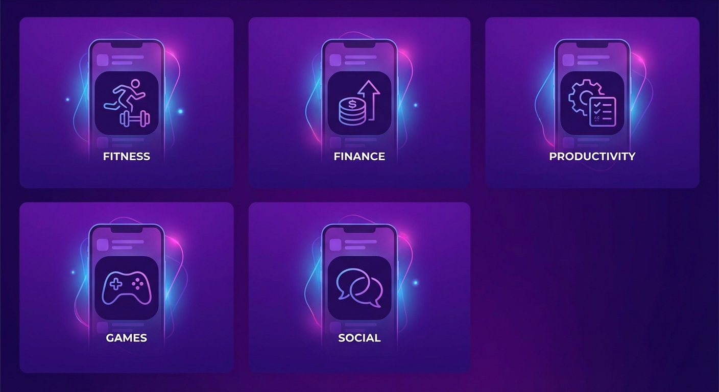
1. Productivity & Task Management
Productivity is one of the most crowded categories on both stores. Users have seen hundreds of task management apps, and their default assumption is that yours is just another to-do list. Your screenshots must break that assumption within the first frame. The category leader pattern here is Outcome → Feature → Proof because productivity users are results-oriented: they want to know what changes in their life before they care about how your app works.
The core psychological driver in this category is the promise of control. Users download productivity apps because they feel overwhelmed. Your screenshots should project calm, clarity, and mastery — the emotional state users want to reach. Avoid showing cluttered interfaces or complex workflows in your first frame, even if your app is powerful. Simplicity in screenshots signals simplicity in use.
Five-frame sequence
- 01 Hero outcome: "Save 5 hours every week" — Show a clean dashboard with completed tasks and a progress ring. The headline sells the result; the screen shows the tool that delivers it. Avoid showing an empty state or onboarding screen.
- 02 Primary differentiator: "AI sorts your priorities" — Display the smart task list with auto-prioritization active. If you have a unique feature like AI sorting, natural language input, or smart scheduling, this is the frame. Show the feature in action with realistic task data.
- 03 Workflow enabler: "Plan your week in one view" — Calendar or weekly planner view. Productivity users are planners, and showing a structured week view signals that your app supports their planning instincts. Use a populated calendar, not an empty one.
- 04 Ecosystem fit: "Syncs with the tools you use" — Integration panel showing connections to Slack, Google Calendar, Notion, or other tools. Productivity users live in ecosystems, and they will not adopt a tool that creates another silo.
- 05 Social proof close: "Loved by 200K+ teams" — Star rating, testimonial snippet, or App Store editorial badge. Close the loop with evidence that the outcome promise is real.
Key messaging angles: Time saved per week, fewer missed deadlines, reduced mental load, cross-platform availability, team collaboration made simple. Productivity users respond to quantified outcomes — "5 hours saved" beats "better productivity" every time.
Common design pitfalls: Showing too many features in a single frame (productivity apps are complex — simplify the visuals). Using empty states or placeholder data that makes the app look unused. Leading with the app's complexity instead of its simplicity. Generic "to-do list" screenshots that look identical to every competitor.
Visual style recommendations: Clean, minimal backgrounds in white, light gray, or soft blue. Sans-serif typography that feels modern and efficient. Generous whitespace around the device frame. Avoid dark mode screenshots as the default — light mode reads as more organized and calm. Consider a subtle gradient from cool blue to white for the background, signaling clarity and focus.
Quick-start template
Pattern: Outcome → Feature → Proof
Hero headline angle: Quantified time savings or reduced overwhelm
Palette: White or soft blue backgrounds, accent color for CTAs
Device framing: iPhone 15 Pro, centered, 70% screen height
Typography: Bold sans-serif, 48pt+ headlines, benefit-driven copy
Differentiator to emphasize: AI, smart scheduling, or integration breadth
2. Health & Fitness
Health and fitness apps sell transformation. Users download them because they want to become a better version of themselves — fitter, calmer, healthier, stronger. The recommended pattern is Before → After Transformation because visual progress is the most compelling proof this category can offer. When a user sees a progress chart climbing upward or a body metric improving over time, the app's value becomes self-evident.
The emotional driver here is aspiration combined with accessibility. Users want ambitious results but fear that the process will be too hard, too confusing, or too time-consuming. Your screenshots need to balance both: show the impressive outcome while also showing that the path to get there is manageable and guided.
Five-frame sequence
- 01 Transformation hook: "Get fit in 15 minutes a day" — A progress chart or before/after split showing measurable improvement. Combine the aspirational result with a time commitment that feels achievable. The "15 minutes" removes the intimidation barrier.
- 02 Personalization: "Workouts built for your body" — Personalized plan screen showing adaptive difficulty, body type selection, or fitness level assessment. Users want to know the app will meet them where they are, not force a one-size-fits-all program.
- 03 In-workout experience: "Follow along. No guesswork." — Active workout screen with exercise animation, timer, and rep counter. This frame proves the app provides real guidance, not just a list of exercises. Show a visually clear, easy-to-follow interface.
- 04 Holistic tracking: "Nutrition built right in" — Meal plan, calorie tracker, or macro breakdown screen. Health-conscious users want an integrated approach. If your app covers nutrition, sleep, hydration, or mindfulness, show that breadth here.
- 05 Community or proof: "Join 2M+ people getting stronger" — Social proof with a community element. Fitness is social — showing that millions of others use the app creates accountability and belonging. Alternatively, show a streak or milestone celebration screen.
Key messaging angles: Achievable time commitments (15 min/day, 3x/week), personalization and adaptability, visible progress tracking, no-equipment-needed options, expert-designed programs. Fitness users respond to specificity: "30-day abs challenge" outperforms "get fit."
Common design pitfalls: Using overly muscular or intimidating imagery that alienates beginners. Showing complex data dashboards before proving the app is easy to follow. Neglecting to show the in-workout experience — users want to see what using the app actually looks like during exercise. Using stock photography instead of actual app screens.
Visual style recommendations: Energetic color palettes — electric green, vibrant orange, or bold coral on dark or charcoal backgrounds. High contrast for readability during workouts. Consider lifestyle-style backgrounds (gym textures, outdoor scenes) behind the device frame to reinforce the fitness context. Bold, impactful typography that feels dynamic. Device frame angled slightly for energy.
Quick-start template
Pattern: Before → After Transformation
Hero headline angle: Achievable transformation with a specific time commitment
Palette: Dark backgrounds with vibrant accent (green, orange, coral)
Device framing: Slightly angled iPhone, 75% screen height, lifestyle bg
Typography: Bold condensed sans-serif, strong contrast, action-oriented copy
Differentiator to emphasize: Personalization, guided workouts, or holistic tracking
3. Finance & Banking
Finance apps face a unique challenge: users must trust you with their most sensitive data before they have even tried the product. The recommended pattern is Outcome → Feature → Proof with a heavy emphasis on trust signals throughout. Every frame should implicitly communicate security, reliability, and professionalism. A single design misstep — an amateur font, a garish color, a cluttered interface — can destroy credibility before the user reads a single headline.
The core emotional driver is financial control and peace of mind. Users are not downloading a finance app because they enjoy budgeting — they are downloading it because they feel anxious about money. Your screenshots should project the calm confidence that comes from having complete visibility into your finances. Show organized data, clear charts, and a sense that everything is under control.
Five-frame sequence
- 01 Control outcome: "See where every dollar goes" — Spending overview dashboard with clean charts and categorized expenses. The headline promises visibility; the screen delivers it. Use realistic but aspirational data — a well-managed budget, not a crisis.
- 02 Automation feature: "Auto-categorize every transaction" — Smart categorization view showing transactions sorted automatically. This signals that the app reduces manual work. Users dread data entry — show them they will not need to do it.
- 03 Goal-setting capability: "Set budgets that actually stick" — Budget creation screen with progress bars and spending limits. Financial goal-setting is a top reason users seek out finance apps. Show a budget that is on track, reinforcing the outcome promise.
- 04 Aggregation or depth: "All your accounts, one dashboard" — Multi-bank aggregation screen or investment overview. This broadens the value proposition from budgeting to complete financial visibility. Show multiple account types connected (checking, savings, credit, investment).
- 05 Trust and security: "Bank-level encryption. Always." — Security badges, encryption indicators, or compliance certifications. This is non-negotiable for finance apps. End with trust because it is the final objection users must resolve before installing a money app.
Key messaging angles: Complete financial visibility, automated categorization, security and encryption, multi-account aggregation, goal tracking and budgets. Finance users respond to control language — "see," "track," "manage," "protect." Avoid speculative language like "grow your wealth" unless backed by specific mechanisms.
Common design pitfalls: Using playful or informal design that undermines trust. Showing unrealistic financial data (million-dollar balances feel fake and unrelatable). Burying security signals at the end or omitting them entirely. Displaying overly complex charts that feel intimidating instead of clarifying. Using bright neon colors or casual fonts that conflict with the seriousness of financial management.
Visual style recommendations: Conservative, premium palette — deep navy, forest green, or charcoal with white or gold accents. Clean sans-serif typography (Inter, SF Pro, or similar). Minimal device bezels and generous padding. White or very light backgrounds convey transparency. A subtle gradient from white to pale blue suggests stability. Avoid dark mode as the default — light mode reads as more trustworthy for financial data.
Quick-start template
Pattern: Outcome → Feature → Proof (trust-heavy close)
Hero headline angle: Complete financial visibility and control
Palette: Navy, forest green, or charcoal with white/gold accents
Device framing: iPhone centered, straight-on, clean white bg
Typography: Professional sans-serif, medium weight, restrained sizing
Differentiator to emphasize: Automation, multi-bank aggregation, or security certifications
4. Social & Messaging
Social and messaging apps have the hardest screenshot challenge: their value is entirely dependent on other people using them. An empty social network is worthless. A messaging app with no contacts is useless. The recommended pattern is Use Case Scenarios because showing the app embedded in real social situations helps users envision themselves as part of an active community, overcoming the "empty room" objection.
The emotional driver is connection and belonging. Users are not looking for features — they are looking for the feeling of being part of something. Your screenshots should show vibrant, active conversations, engaged communities, and the emotional payoff of social interaction: laughter in group chats, shared moments in stories, meaningful exchanges in DMs.
Five-frame sequence
- 01 Connection hook: "Stay close to the people who matter" — Active conversation list or feed showing recent interactions from multiple contacts. The screen should feel alive with activity — profile photos, message previews, timestamps showing recent engagement.
- 02 Group experience: "Group chats that actually work" — A lively group conversation with reactions, replies, and shared media. Show 4-6 participants actively engaging. This proves the app supports the social dynamics users care about most.
- 03 Expression features: "Say it your way" — Stickers, GIFs, voice messages, custom reactions, or video call interface. Social apps differentiate through expression. Show the unique ways users can communicate beyond plain text.
- 04 Sharing or discovery: "Share moments as they happen" — Stories, photo sharing, or content discovery feed. This shows the app is more than messaging — it is a platform for shared experiences. Use vibrant, real-looking content.
- 05 Privacy and trust: "End-to-end encrypted. Always." — Privacy controls, disappearing messages, or encryption indicator. Privacy is a decisive factor for messaging apps. Close with the trust signal that differentiates you from less secure alternatives.
Key messaging angles: Active and engaged community, rich expression tools (stickers, GIFs, voice), privacy and encryption, cross-platform availability, group features that work seamlessly. Social users respond to social proof implicitly — screenshots that look busy and alive signal that the community is thriving.
Common design pitfalls: Showing an empty or sparse feed that makes the community look dead. Using obviously fake conversations with generic placeholder text. Displaying too many features at once instead of focusing on the social experience. Neglecting privacy messaging entirely — post-2020 users expect it. Making the app look like a clone of WhatsApp, iMessage, or Instagram without showing what is different.
Visual style recommendations: Warm, social colors — soft purples, gradients from pink to orange, or brand-specific vibrant tones. Rounded corners and friendly typography signal approachability. Show realistic profile photos and diverse user avatars (not stock photos — illustrated or AI-generated avatars work well). Background can be a soft gradient or solid color that complements the chat UI. Consider frameless screenshots that bleed the chat interface edge-to-edge for immersion.
Quick-start template
Pattern: Use Case Scenarios (social moments throughout the day)
Hero headline angle: Connection, closeness, and staying in touch
Palette: Warm gradients (purple-to-pink, orange-to-coral), friendly tones
Device framing: Frameless or minimal bezel, immersive chat view
Typography: Rounded, friendly sans-serif, conversational tone
Differentiator to emphasize: Community activity, expression tools, or privacy
5. Photo & Video Editing
Photo and video apps have an unfair advantage in screenshots: the output is the proof. A stunning edited photo in Frame 1 does more selling than any headline ever could. The recommended pattern is Before → After Transformation because visual contrast is the single most persuasive argument a creative tool can make. Users do not need to read about your filters — they need to see the result.
The emotional driver is creative empowerment. Users want to produce professional-looking content without professional skills. Your screenshots should make the user think: "I could make that." The transformation should be dramatic enough to impress but achievable enough to feel within reach. A photo that goes from decent to stunning is more motivating than one that goes from bad to good.
Five-frame sequence
- 01 Transformation reveal: "Studio quality in one tap" — Split-screen or side-by-side before/after of a photo or video edit. The transformation should be immediately visible at thumbnail size. Choose your most impressive edit — the one that makes people stop scrolling.
- 02 Hero tool: "Remove anything. Keep everything." — AI background removal, object eraser, or the signature feature that defines your app. Show the tool in action with a clear before/after within the tool interface. This is your differentiator frame.
- 03 Creative range: "200+ filters. Zero effort." — Filter gallery, preset library, or effects panel. Show variety — a grid of the same photo with different treatments applied. This demonstrates breadth and the ease of achieving different looks.
- 04 Precision tools: "Fine-tune every detail" — Advanced editing panel with sliders, curves, layers, or masking tools. This frame appeals to more advanced users and signals depth. Show the interface clean and usable, not overwhelming.
- 05 Export and share: "Share-ready in seconds" — Export screen showing multiple format options, social media presets, or a "post to Instagram" flow. Close with the final step: getting the content out into the world. This resolves the "then what?" question.
Key messaging angles: Professional results without professional skills, AI-powered editing, vast filter and preset libraries, one-tap enhancements, social media-ready exports. Photo and video users respond to visual proof — the images in your screenshots do more selling than the headlines.
Common design pitfalls: Using low-quality sample photos that undermine the "professional quality" claim. Showing the editing interface without showing the result. Displaying too many controls in one frame, making the app look complex. Using the same photo across all frames instead of showing variety. Forgetting to show before/after contrast — showing only the "after" wastes the most powerful persuasion tool in this category.
Visual style recommendations: Dark backgrounds (charcoal, near-black) to make photos pop — like a gallery wall. Minimal chrome around the device frame so the content takes center stage. If using device frames, keep them subtle. Consider full-bleed screenshots where the edited photo fills the entire frame with a headline overlay. Typography should be elegant but not distracting — the visuals are the star.
Quick-start template
Pattern: Before → After Transformation
Hero headline angle: Dramatic visual transformation with minimal effort
Palette: Dark/charcoal backgrounds to let content pop
Device framing: Minimal or frameless, content-forward presentation
Typography: Elegant, lightweight, secondary to the visuals
Differentiator to emphasize: AI tools, filter variety, or one-tap editing
6. Travel & Navigation
Travel apps sell experiences. Users are not looking for a booking interface — they are looking for their next adventure. The recommended pattern is Use Case Scenarios because travel decisions are driven by imagining yourself in a destination. Each frame should place the app in a different travel scenario: planning, booking, navigating, exploring, and remembering. The screenshots should evoke wanderlust.
The emotional driver is anticipation and discovery. The moment someone opens a travel app, they are dreaming about their next trip. Your screenshots should amplify that feeling. Use aspirational destination imagery, seamless booking flows, and the confidence that comes from having everything organized in one place. Travel anxiety — missing a flight, getting lost, overpaying — is the counterpoint. Show that your app eliminates it.
Five-frame sequence
- 01 Dream and discover: "Your next adventure starts here" — Destination discovery screen with beautiful location imagery, curated recommendations, or a search interface over a stunning travel photo. The first frame should make users feel the pull of travel.
- 02 Book with confidence: "Best prices, guaranteed" — Booking comparison, price alert, or deal screen. Travel users are price-sensitive. Showing competitive pricing or savings signals value. Include specific numbers: "$127/night" feels real; "great deals" feels vague.
- 03 Plan and organize: "Every detail in one place" — Itinerary view, trip planner, or saved places list. Show a well-organized trip with flights, hotels, activities, and reservations in a clean timeline. This resolves the planning anxiety that travel users feel.
- 04 Navigate and explore: "Never get lost again" — Map view with points of interest, walking directions, or offline map capability. For navigation apps, this is the hero frame. Show turn-by-turn directions or a rich point-of-interest layer over the map.
- 05 Trust and community: "Trusted by 10M+ travelers" — User reviews of destinations, community tips, or a social proof close with download metrics. Travel decisions are heavily influenced by peer recommendations. Show that your community is active and helpful.
Key messaging angles: Best prices and savings, all-in-one trip organization, offline access (critical for international travel), local recommendations and hidden gems, seamless booking flow. Travel users respond to specificity: "Save up to 40% on hotels" beats "find great deals."
Common design pitfalls: Using generic stock photography of landmarks that feels impersonal. Showing a complex booking flow with too many form fields visible. Neglecting offline capability messaging — travel users worry about connectivity abroad. Displaying an empty itinerary instead of a rich, populated trip plan. Focusing entirely on booking without showing the exploration and in-trip experience.
Visual style recommendations: Warm, inviting colors — sunset oranges, ocean blues, or earthy tones. Use destination photography as backgrounds behind the device frame to create atmosphere. Consider full-bleed destination images with UI overlays for maximum emotional impact. Typography should feel adventurous but readable — a semi-bold geometric sans-serif works well. Rounded corners and card-based layouts feel modern and approachable.
Quick-start template
Pattern: Use Case Scenarios (plan → book → explore → remember)
Hero headline angle: Adventure, discovery, and hassle-free travel
Palette: Warm travel tones (sunset, ocean, earth) with destination photos
Device framing: iPhone over destination photo background, centered
Typography: Semi-bold geometric sans-serif, adventurous but clear
Differentiator to emphasize: Price savings, offline maps, or trip planning
7. Education & Learning
Education apps are selling a future version of the user: someone who speaks a new language, understands a complex topic, or has a valuable new skill. The recommended pattern is Outcome → Feature → Proof because learning outcomes are measurable and aspirational. Users want to know what they will gain (fluency, certification, knowledge) before they evaluate the method (lessons, quizzes, flashcards).
The emotional driver is self-improvement and progress. Education app users are motivated but easily discouraged. Your screenshots must show that learning with your app is engaging, structured, and rewarding. Streak counters, progress bars, achievement badges, and level-up animations all serve to communicate that the learning journey is gamified and motivating, not dry and tedious.
Five-frame sequence
- 01 Outcome promise: "Speak Spanish in 30 days" — Progress dashboard or skill tree showing advancement from beginner to intermediate. The headline should name the specific skill and a timeframe. Specificity converts — "30 days" beats "quickly."
- 02 Engaging lesson format: "Lessons that feel like games" — Interactive lesson screen with gamified elements: drag-and-drop, multiple choice with illustrations, or a conversation simulation. This frame proves the learning is engaging, not boring.
- 03 Personalized path: "Your pace. Your path." — Adaptive learning dashboard, placement test result, or customized curriculum view. Show that the app meets users at their level and adjusts to their speed. Personalization reduces the fear of being left behind or held back.
- 04 Progress and motivation: "Watch your streak grow" — Streak counter, achievement badges, leaderboard, or weekly progress report. Gamification mechanics are critical for retention in education, and showing them in screenshots signals that the app keeps users coming back.
- 05 Social proof or credentials: "50M+ learners worldwide" — Download milestone, App Store editorial badge, or user testimonial from someone who achieved the promised outcome. Education users want proof that the method works for real people.
Key messaging angles: Specific skill outcomes with timeframes, bite-sized lessons that fit any schedule, gamified learning that keeps you motivated, adaptive difficulty, progress tracking and streaks. Education users respond to transformation language — "become fluent" rather than "practice vocabulary."
Common design pitfalls: Making the app look like a textbook — dense text, minimal interactivity, boring layouts. Showing content that is too simple (basic flashcards) or too complex (walls of text). Neglecting to show gamification elements that differentiate mobile learning from traditional education. Using childish visuals for adult-targeted apps or vice versa. Failing to show the "fun" factor — education apps must prove they are enjoyable.
Visual style recommendations: Bright, friendly palette — vibrant greens, warm yellows, sky blues, or a signature brand color. Rounded shapes and illustrated elements create a welcoming, approachable feel. White or light backgrounds with pops of color for interactive elements. Character illustrations or mascots work well for language and children's education apps. Typography should be clean and highly readable — learning content demands clarity above all else.
Quick-start template
Pattern: Outcome → Feature → Proof
Hero headline angle: Specific skill acquisition with a timeframe
Palette: Bright, friendly colors (green, yellow, sky blue) on white
Device framing: iPhone centered, white background, playful accents
Typography: Rounded, friendly sans-serif, highly readable
Differentiator to emphasize: Gamification, adaptive learning, or bite-sized lessons
8. Food & Delivery
Food and delivery apps live and die by appetite appeal. When a user sees your screenshots, they should feel hungry. The recommended pattern is Feature Stack with Progressive Disclosure because food apps have multiple value propositions that each deserve a dedicated frame: restaurant variety, speed of delivery, real-time tracking, and pricing. Each frame should feature mouth-watering food photography alongside clean UI.
The emotional driver is instant gratification and convenience. Users opening a food app want two things: delicious food and minimal effort. Your screenshots should show beautiful food arriving quickly and easily. Speed messaging is critical — "delivered in 30 minutes" or "order in under 60 seconds" directly addresses the urgency that defines this category.
Five-frame sequence
- 01 Variety and appeal: "Craving it? We deliver it." — Restaurant discovery or food category grid with high-quality food photography. The first frame should make the user's mouth water. Show diverse cuisine types (sushi, pizza, salads, burgers) to signal breadth.
- 02 Speed and ease: "From order to door in 30 minutes" — Order tracking screen showing the delivery timeline or a simple ordering flow. Speed is the primary differentiator. Show the countdown or estimated delivery time prominently.
- 03 Real-time tracking: "Watch your order, live" — Map view with driver location, delivery status updates, and ETA. Real-time tracking reduces anxiety and keeps users engaged. Show the driver en route with a clear progress indicator.
- 04 Deals and savings: "Free delivery on your first order" — Promotions screen, loyalty rewards, or pricing comparison. Food delivery is price-competitive. Show that your app offers value — free delivery, loyalty points, exclusive discounts, or bundle deals.
- 05 Ratings and trust: "5-star restaurants at your fingertips" — Restaurant ratings, user reviews, or "trusted by 5M+ food lovers" social proof badge. Close with the confidence that the restaurants are vetted and the food quality is reliable.
Key messaging angles: Speed of delivery, restaurant variety and quality, real-time order tracking, first-order discounts and loyalty rewards, dietary options (vegan, gluten-free, halal). Food users respond to sensory triggers — food photography matters more than UI screenshots in this category.
Common design pitfalls: Using poor-quality food photography that looks unappetizing. Showing a cluttered menu interface instead of leading with food imagery. Focusing too heavily on the delivery logistics without showing the food. Displaying complex checkout flows or overwhelming filter options. Neglecting to mention pricing, deals, or free delivery offers — price sensitivity is extremely high in this category.
Visual style recommendations: Warm, appetizing palette — rich reds, warm oranges, golden yellows on white or cream backgrounds. Food photography should be the dominant visual element, with the app UI complementing rather than competing. Consider full-bleed food imagery with a frosted glass UI overlay. Clean, modern typography that does not distract from the food. Warm lighting and saturated colors in all food images. Avoid cool-toned backgrounds (blue, gray) that suppress appetite.
Quick-start template
Pattern: Feature Stack with Progressive Disclosure
Hero headline angle: Delicious food delivered fast and effortlessly
Palette: Warm reds, oranges, and yellows on white or cream
Device framing: iPhone with food photography prominent, warm bg
Typography: Modern sans-serif, warm tones, appetite-driven copy
Differentiator to emphasize: Delivery speed, restaurant variety, or first-order deals
9. Entertainment & Streaming
Entertainment and streaming apps sell content, not features. Users do not care about your streaming technology, your recommendation algorithm, or your download manager — they care about what they can watch, listen to, or play. The recommended pattern is Social Proof Anchoring because entertainment is a trust-driven category. If 50 million people are using your app, the content must be worth it. If a major publication reviewed it favorably, it must deliver quality.
The emotional driver is escapism and enjoyment. Users are looking for their next binge-worthy show, their new favorite playlist, or the game they will not be able to put down. Your screenshots should evoke the excitement of discovering something amazing. Content artwork, not UI, should dominate every frame.
Five-frame sequence
- 01 Content showcase: "Thousands of shows. Zero ads." — A rich content library view with recognizable titles, artwork tiles, and curated rows. Lead with the breadth of content. If you have exclusive or original content, feature it prominently. The headline should address the primary value prop (ad-free, exclusive content, unlimited access).
- 02 Personalized discovery: "Picks made for you" — Personalized recommendation row or "For You" feed. Show that the app learns user preferences and surfaces relevant content. Personalization reduces the "what should I watch" friction that plagues entertainment apps.
- 03 Viewing experience: "Watch anywhere. Anytime." — Full-screen playback view, multi-device compatibility, or offline download feature. Show the actual consumption experience — the immersive, full-screen moment that is the core product. Mention offline access if available.
- 04 Multi-profile or social: "Everyone gets their own space" — Multiple user profiles, watchlists, or social features like shared playlists. Family-friendly features (parental controls, kids' profiles) broaden appeal. Show that the app serves entire households, not just individuals.
- 05 Social proof and pricing: "Join 50M+ viewers. Start free." — User count, ratings, awards, or free trial offer. Entertainment is a crowded subscription market. Leading with a free trial or competitive pricing in the final frame removes the last barrier. Social proof reinforces the decision.
Key messaging angles: Content breadth and exclusives, ad-free experience, offline downloads, personalized recommendations, family profiles and parental controls, free trial or competitive pricing. Entertainment users respond to content — show them what they can watch or listen to, not how the app works.
Common design pitfalls: Showing too much UI and too little content. Using placeholder or generic content artwork instead of recognizable titles. Displaying the settings or account management screen (no one cares). Neglecting to mention pricing or free trial — subscription fatigue is real, and users want to know the cost before installing. Making all frames look identical (rows of content tiles) without visual variety.
Visual style recommendations: Dark, cinematic backgrounds — deep black or near-black to mimic a theater or streaming interface. Let content artwork provide the color. Subtle gradients from dark to slightly lighter can add depth. Large typography for headlines, but keep text minimal — the content artwork speaks louder. Consider edge-to-edge content layouts without device frames for maximum immersion. Use a red, purple, or brand-colored accent for interactive elements.
Quick-start template
Pattern: Social Proof Anchoring (content-led)
Hero headline angle: Content breadth, exclusives, or ad-free experience
Palette: Dark cinematic backgrounds, content artwork provides color
Device framing: Frameless or full-bleed, immersive content presentation
Typography: Large, bold, minimal — headlines only, let content sell
Differentiator to emphasize: Exclusive content, ad-free, or offline access
10. Utilities & Tools
Utilities are the hardest category to make visually exciting in screenshots. A flashlight app, a QR scanner, a file manager, a VPN — these tools solve specific problems but rarely produce visually stunning interfaces. The recommended pattern is Feature Stack with Progressive Disclosure because utility apps are evaluated on capability breadth. Users want to know: does it do what I need, and does it do more than the alternatives?
The emotional driver is problem resolution and reliability. Users download utility apps because they have a specific problem right now: storage is full, they need to scan a QR code, their Wi-Fi is slow, they need a VPN for travel. Your first screenshot must match that intent immediately. There is no time for storytelling — lead with the exact solution the user is searching for.
Five-frame sequence
- 01 Core function hero: "Scan anything. Instantly." — The primary use case in action. For a scanner, show the scan happening. For a VPN, show the connected state with a protected indicator. For a cleaner, show storage reclaimed. The first frame must answer "What does it do?" in under two seconds.
- 02 Speed or efficiency: "12 GB reclaimed in seconds" — Show the tool in action with a quantified result. Speed and efficiency are the primary differentiators for utility apps. Use specific numbers: "3x faster," "12 GB freed," "connected in 0.5 seconds."
- 03 Secondary capability: "Manage files like a pro" — A related feature that broadens the value proposition. For a scanner: OCR text recognition. For a VPN: multiple server locations. For a cleaner: duplicate photo finder. This frame shows depth beyond the basic function.
- 04 Advanced or unique feature: "Works even offline" — The capability that differentiates you from free alternatives or built-in OS tools. Offline mode, batch processing, widget support, Shortcuts integration, or cross-device sync. Show why your app is worth installing over the default option.
- 05 Ratings and simplicity: "4.8 stars. 100K+ downloads." — Social proof with an emphasis on simplicity and reliability. Utility users value tools that just work. "Simple, fast, reliable" is a more compelling close than a feature list. Consider adding "No ads. No tracking." if applicable.
Key messaging angles: Speed and efficiency (quantified), simplicity and ease of use, reliability (it just works), no ads or tracking, offline capability, superiority over built-in OS alternatives. Utility users are pragmatic — they respond to concrete performance metrics, not emotional storytelling.
Common design pitfalls: Making the app look boring or generic — utility apps need visual polish to stand out. Using technical jargon that non-technical users will not understand (avoid "AES-256 encryption" — say "bank-level security" instead). Showing too many settings or configuration options that make the app look complex. Failing to differentiate from the built-in iOS or Android equivalent. Not showing quantified results — "cleans your phone" is weak; "freed 12 GB in 30 seconds" is strong.
Visual style recommendations: Clean, technical aesthetic — dark gradients (dark blue to black for VPN and security apps), or bright and clean (white to light blue for scanners and tools). Accent colors should be bold and singular — one strong color that defines the brand. Minimal device framing; the UI should feel utilitarian and professional. Consider showing a before/after result comparison even for utilities (storage before vs. after cleaning). Iconography and infographic-style elements can make dry functionality visually interesting.
Quick-start template
Pattern: Feature Stack with Progressive Disclosure
Hero headline angle: Core function with quantified performance
Palette: Dark gradients for security/VPN; bright white for scanners/tools
Device framing: iPhone centered, minimal bezels, function-first layout
Typography: Technical sans-serif, clear hierarchy, metric-driven
Differentiator to emphasize: Speed, offline mode, or no-ads promise
Summary comparison: all 10 categories at a glance
Use this table as a quick reference when starting a new screenshot project. Find your category, apply the recommended pattern, and use the hero headline angle and visual style as your creative starting point.
Category comparison matrix
| Category | Best pattern | Hero headline angle | Visual style |
|---|---|---|---|
| Productivity | Outcome → Feature → Proof | Quantified time savings | White/soft blue, clean sans-serif |
| Health & Fitness | Before → After | Achievable transformation + time commitment | Dark bg, vibrant accents (green, orange) |
| Finance & Banking | Outcome → Feature → Proof | Financial control and visibility | Navy/green, professional typography |
| Social & Messaging | Use Case Scenarios | Connection and belonging | Warm gradients, friendly rounded type |
| Photo & Video | Before → After | Dramatic visual transformation | Dark/charcoal, content-forward |
| Travel & Navigation | Use Case Scenarios | Adventure and hassle-free travel | Warm travel tones, destination photos |
| Education & Learning | Outcome → Feature → Proof | Skill acquisition with timeframe | Bright, friendly colors on white |
| Food & Delivery | Feature Stack | Delicious food, fast delivery | Warm reds/oranges, food photography |
| Entertainment | Social Proof Anchoring | Content breadth and exclusives | Dark cinematic, content artwork dominant |
| Utilities & Tools | Feature Stack | Core function with metrics | Technical dark or clean white, metric-driven |
Notice the pattern distribution: Outcome → Feature → Proof appears three times (Productivity, Finance, Education) — these are categories where measurable results drive decisions. Before → After appears twice (Fitness, Photo/Video) — categories where visual transformation is the product. Feature Stack appears twice (Food, Utilities) — categories where breadth of capability matters most. Use Case Scenarios appears twice (Social, Travel) — categories where lifestyle integration is the value proposition. Social Proof Anchoring appears once (Entertainment) — a category where content reputation precedes everything.
These are starting recommendations, not rules. The best screenshot sets often hybridize two patterns: an outcome hook from Pattern 1 followed by a feature stack from Pattern 3, or a before/after open from Pattern 2 followed by social proof from Pattern 4. Use the category recommendations as your foundation, then test variations to find what converts best for your specific app and audience.
Cross-category principles that always apply
Regardless of your category, certain screenshot principles are universal. These apply to every app, every store, and every audience:
- Frame 1 gets 10x the views of Frame 5. Invest disproportionately in your first screenshot. It appears in search results, category rankings, and feature cards. Most users will never swipe past Frame 2. Your best argument belongs in Frame 1.
- Headlines must be readable at thumbnail size. The App Store shows screenshots at roughly 40% of their actual size in search results. If your headline disappears at that scale, it is not working. Use 48pt equivalent or larger, with high contrast against the background.
- Show real data, not empty states. A populated interface builds credibility. An empty one looks like a demo. Fill your app screens with realistic content that shows the app in a mature, active state. Users want to see what the app looks like after they have been using it, not during onboarding.
- Maintain visual consistency across frames. Use the same headline position, font, device frame style, and background treatment in every screenshot. Consistency signals design quality and makes the set feel cohesive when swiped as a sequence.
- Localize your screenshots for every major market. Screenshots with localized headlines and culturally appropriate content convert significantly better in international markets. A Japanese user expects Japanese copy. A German user expects German precision. PerfectDeck supports 40+ languages for exactly this reason.
- Test and iterate. No framework replaces data. Run A/B tests on your screenshot sequences, headline variations, and visual styles. Measure tap-through rate from search results and conversion rate from the product page. Small improvements compound into significant performance gains over time.