Guide
How to create App Store screenshots that convert
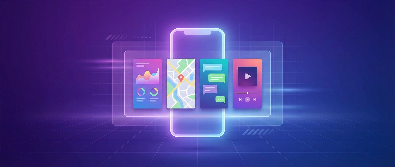
High-converting App Store screenshots follow a narrative structure: lead with the primary outcome, reinforce trust with proof, then show depth through features. This guide walks through each step so you can build a set that improves conversion on both iOS and Google Play.
1. Lead with the outcome
The first two screenshots are the most important frames in your entire set. On iOS, they appear in search results before a user even taps into your listing. On Google Play, the first frame often determines whether someone keeps scrolling.
Your opening frame should answer one question: "Why should I download this app?" Avoid feature lists or technical descriptions here. Instead, focus on the transformation your app delivers.
Examples of outcome-first headlines
- "Track every habit. Hit every goal." (not "Habit tracking with reminders")
- "Send invoices in 30 seconds." (not "Invoice creation and management")
- "Sleep better tonight." (not "Sleep tracking and analysis app")
2. Build a clear feature sequence
After the opening outcome frame, dedicate 3-4 frames to individual features or capabilities. The key principle: one feature per frame. This keeps visual hierarchy clean and makes each frame scannable on small screens.
Sequence your features by perceived value. Put the feature most likely to drive conversion immediately after the hero frame. Save niche or power-user features for later positions.
Recommended structure
- 1. Hero outcome frame
- 2. Primary differentiator
- 3. Key workflow / ease of use
- 4. Secondary feature or integration
- 5. Social proof or localization signal
Common mistakes
- - Cramming multiple features into one frame
- - Using identical layouts for every frame
- - Burying the best feature at position 6+
- - Forgetting a clear CTA on the final frame
3. Keep typography readable
Your screenshots will be viewed on screens as small as 4.7 inches. Typography that looks fine on a design tool canvas can become illegible at actual display size in the App Store.
Use large headlines (5-7 words max) and keep supporting text to a single line when possible. Prioritize contrast between text and background. Avoid placing text over busy parts of screenshots where legibility suffers.
Typography checklist
- Headlines are readable at 50% zoom on your design tool
- Contrast ratio between text and background meets WCAG AA (4.5:1 minimum)
- No more than two font weights per frame (e.g., bold headline + regular body)
- Text avoids the top and bottom 10% of the frame (safe area)
4. Maintain brand consistency
Use the same typography scale, color palette, and device framing across every screenshot in your set. Consistency builds trust, speeds comprehension, and creates a professional impression that signals quality.
Define a system before you start: pick your headline font, body font, primary color, secondary color, and background treatment. Lock these choices so every variant and locale stays on-brand.
This is where most teams lose time. Without guardrails, each iteration drifts slightly, and the final set looks inconsistent. Tools like PerfectDeck let you set brand rules once and enforce them automatically across every frame.
5. Localize for global markets
Localized App Store screenshots improve conversion in every international market you target. Users are significantly more likely to install an app when the screenshots are in their native language.
Plan for text expansion from the start. German and French copy can run 20-30% longer than English. Build extra spacing into your layouts so translations don't break your design. Also consider cultural relevance for imagery, metaphors, and social proof.
Read our complete guide on localizing App Store screenshots.
6. Test and iterate
Your first set of screenshots is a starting point, not a final answer. The best-performing apps treat their store listing as a living asset. Run experiments on headline copy, frame ordering, and visual treatment to find what resonates with your audience.
Apple offers Product Page Optimization (PPO) for A/B testing on iOS. Google Play has Store Listing Experiments. Use these tools to test different screenshot sequences and measure which versions drive higher conversion rates.
Focus your tests on high-impact variables: the hero frame headline, the sequence of features, and whether social proof frames improve or hurt conversion at different positions.
Create App Store screenshots with PerfectDeck
Turn raw app screens into launch-ready visuals with AI-powered layouts, brand guardrails, and localization for 40+ languages.
Related resources
Checklist
App Store screenshot checklist for ASO
Examples
ASO screenshot examples and storytelling patterns
Glossary
ASO glossary for App Store screenshots
Strategy
Global expansion and localization strategy
Growth
Budget-friendly growth tactics for indie apps
Strategy
Competitive analysis and benchmarking