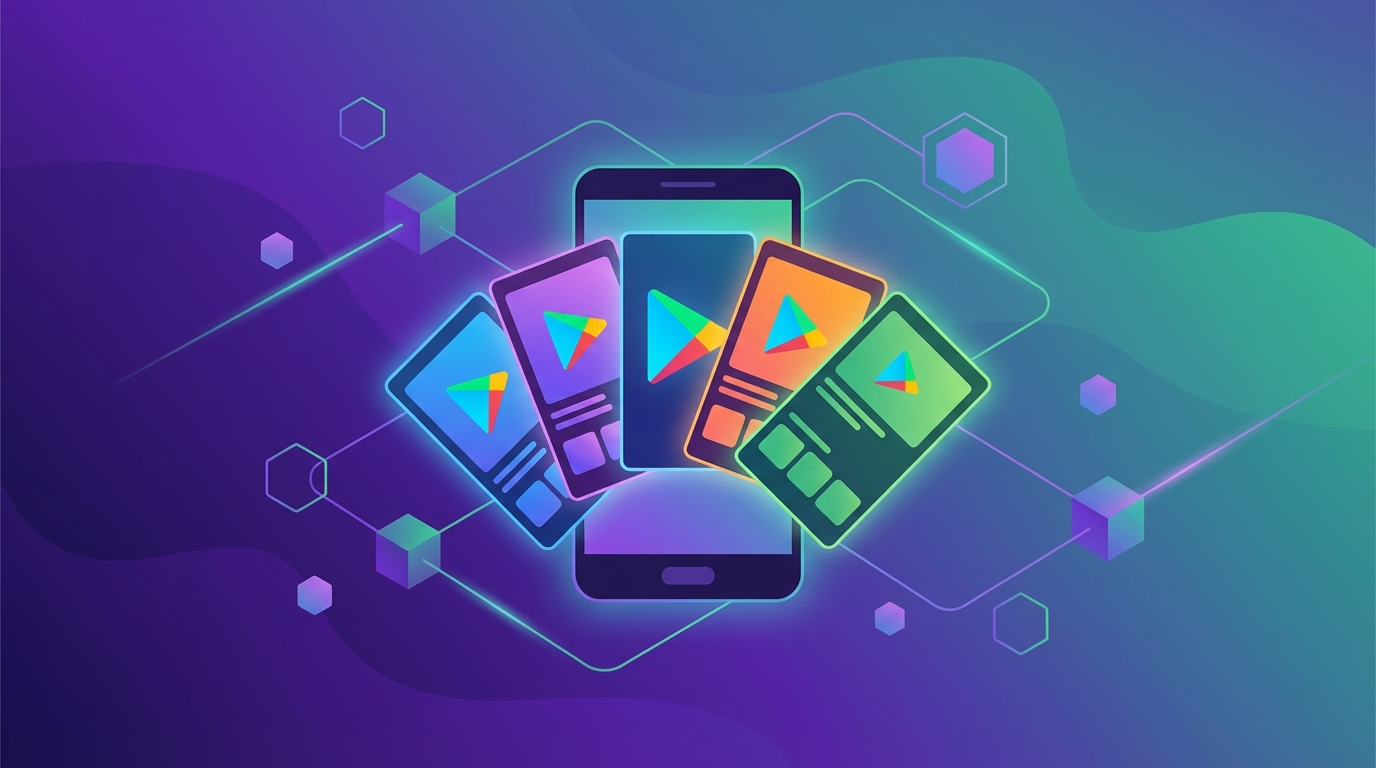
1. How Google Play screenshots differ from iOS
The two stores look similar on the surface, but they present screenshots in fundamentally different ways — and those differences should shape your entire design approach from day one.
Screenshot display and scrolling behavior
On Google Play, screenshots appear as a horizontally scrolling carousel in search results and listing pages. Users see your first two or three frames without tapping into the full listing. The carousel renders at a smaller thumbnail size compared to the App Store, which means text legibility at reduced dimensions is a critical design constraint that does not apply with the same severity on iOS.
On iOS, screenshots also appear in search results, but the rendering size, padding, and scroll behavior differ enough that you cannot reuse identical assets across both platforms and expect the same performance. The App Store renders screenshots at a larger relative size in search results, and the vertical layout on iOS product pages presents frames differently than Google Play's horizontal-first approach.
Auto-play video competition
Google Play supports auto-playing promotional videos that appear above the screenshot carousel on listing pages. When a video is present, it plays automatically on Wi-Fi connections, pulling user attention before they ever see your screenshots. This means your first screenshot frame competes against video content in a way that does not happen on the App Store, where video previews are embedded within the screenshot carousel itself.
If your competitors use video and you do not, your static screenshots need to work even harder to capture attention. Conversely, if you do upload a video, your feature graphic (1024 x 500 pixels) becomes the video poster image — making it an additional visual asset that iOS does not require.
Different device aspect ratios and Material Design expectations
Android devices span a much wider range of aspect ratios than iOS — from 16:9 to 20:9 and beyond on foldables. This diversity means your screenshots will be viewed on displays with very different proportions. Additionally, Android users are accustomed to Material Design conventions: rounded corners, elevation shadows, specific spacing rhythms, and system UI patterns that differ from iOS Human Interface Guidelines. Screenshots that use iOS-style navigation bars, segmented controls, or Apple-specific UI patterns look out of place on Google Play and signal to users that the developer does not prioritize Android.
Screenshot count limits
Google Play allows a maximum of 8 screenshots per device type (phone, 7-inch tablet, 10-inch tablet, Chromebook, and Android TV). The App Store permits up to 10 per display size. With fewer frames available, each Google Play screenshot must work harder — every slot needs to communicate a distinct, meaningful benefit. Do not waste a single frame on filler content, repeated messaging, or decorative screens that do not move the user closer to installing.
Platform comparison
Google Play
- 8 screenshots per device type
- Horizontal carousel in search
- Auto-play video above carousel
- Feature graphic (1024 x 500)
- Smaller thumbnail rendering
App Store
- 10 screenshots per display size
- Vertical layout on product pages
- Video previews in carousel
- No feature graphic equivalent
- Larger thumbnail rendering
Key takeaway
Never treat Google Play as a secondary export target. Design for the Play Store's specific layout, thumbnail sizes, video competition, Material Design expectations, and screenshot limits from the start — or create a dedicated set for Android alongside your iOS assets.
2. Design for Android device diversity
Android runs on thousands of device models from dozens of manufacturers, each with different screen sizes, aspect ratios, pixel densities, and display technologies. Unlike iOS, where you design for a handful of known display sizes, Android screenshots must account for a broad spectrum of screen geometries that your users will be browsing on when they encounter your listing.
The aspect ratio spectrum
Your screenshots render on devices spanning 16:9, 18:9, 19.5:9, and 20:9 displays — and even 21:9 on some Sony Xperia models and ultrawide foldable configurations. A screenshot designed exclusively for 16:9 will display with letterboxing or cropping on taller devices, while one designed for 20:9 may show excess space on older 16:9 panels.
The practical implication: your composition must be aspect-ratio-agnostic. Center your critical content vertically and horizontally, and avoid placing essential text or UI elements in areas that might be cropped or awkwardly spaced on different ratios.
Build generous padding
Keep all critical text and UI elements at least 5-8% inward from every edge of the screenshot frame. This safe margin ensures content is never clipped by rounded display corners, camera notches, punch-hole cutouts, or the system navigation bar area on gesture-navigation devices. Edge-aligned text is one of the most common mistakes on Google Play — it looks acceptable on the designer's screen but gets cut off on the user's device.
Avoid edge-aligned text
Left-flushed or right-flushed headlines that sit close to the frame edge are particularly vulnerable on Android. Between rounded corners, notch intrusions, and varying system UI overlays, edge-proximate text is the first thing to get clipped. Use centered text alignment or generous side margins (at least 60px on each side at 1080p resolution) to prevent readability issues.
Use centered compositions that scale gracefully
A centered layout with a clear vertical hierarchy — headline at top, device mockup or key visual in the center, supporting text below — scales better across the Android device range than edge-to-edge or asymmetric layouts. This approach ensures your design degrades gracefully regardless of whether the user is viewing on a compact 5.5-inch phone, a 6.7-inch flagship, or a 7.6-inch foldable.
- Test at multiple aspect ratios. Preview your screenshots at 16:9, 18:9, 19.5:9, and 20:9 to verify that no critical element is cut off. If your app targets tablets, also test at 4:3 and 16:10.
- Avoid full-bleed device frames that assume a specific bezel shape. Generic, clean frames — or frameless presentations — look better across the ecosystem than frames modeled after a single flagship device.
- Consider foldables. Samsung Galaxy Z Fold, Google Pixel Fold, and similar devices are growing in market share. If your app supports multi-window or large-screen layouts, showing those screens can differentiate your listing from competitors who only show standard phone layouts.
- Design for the mid-range, not the flagship. Most Android users worldwide are on mid-range devices with smaller screens and lower pixel densities. If your screenshots look great on a Samsung Galaxy A-series phone, they will look excellent on a Pixel Pro or Galaxy S Ultra.
Android aspect ratio reference
| Ratio | Common devices | Market share |
|---|---|---|
| 16:9 | Older Samsung, budget devices | Declining, still ~15% |
| 18:9 | Most mid-range Android phones | ~25% |
| 19.5:9 | Samsung Galaxy S series, iPhones | ~35% |
| 20:9 | Samsung Galaxy A5x, Pixel | ~20% |
| 21:9+ | Sony Xperia, foldables (outer) | ~5% |
Pro tip
Use a centered layout with generous padding around text and device mockups. This "safe zone" approach ensures your screenshots degrade gracefully across the full range of Android screen geometries. If your headline is readable and your mockup is fully visible on a 16:9 device, it will look great everywhere else.
3. Google Play size requirements
Google Play Console enforces specific dimension, format, and file size rules for screenshots. Getting these wrong will block your upload entirely, so verify every asset before submitting.
Core dimension rules
- Minimum dimension: 320 pixels on the shortest side. Screenshots smaller than this on any axis will be rejected by Google Play Console.
- Maximum dimension: 3840 pixels on the longest side. This accommodates ultra-high-resolution exports, but in practice, going above 2560px on any side provides minimal visual benefit and increases file size.
- Aspect ratio constraint: The longest side cannot be more than twice the length of the shortest side (maximum 2:1 ratio). In practice, 16:9 (landscape) or 9:16 (portrait) are the most common and recommended aspect ratios for phone screenshots.
- Minimum count: At least 2 screenshots are required per supported device type. You can upload up to 8 per type.
Phone screenshot specifications
For phone screenshots, the 16:9 aspect ratio is recommended. The most widely used resolution is 1080 x 1920 pixels (portrait) or 1920 x 1080 (landscape). This resolution renders crisply on the vast majority of Android phones and stays well within Google Play's dimension limits. If you want sharper detail on high-density flagship displays, you can scale up to 1440 x 2560 pixels, but ensure your file sizes stay under the per-file cap.
Portrait vs. landscape orientation
Most apps use portrait orientation (9:16) for phone screenshots because that is how users hold their phones while browsing the Play Store. Landscape orientation (16:9) is appropriate for games, video apps, and other content that is primarily consumed in landscape mode. You can mix orientations within a single listing, but this creates a jarring visual experience in the carousel — stick to one orientation for the entire set unless you have a specific reason not to.
Phone screenshot specs
Tablet requirements (7-inch and 10-inch)
If your app supports tablets, Google Play Console lets you upload separate screenshot sets for 7-inch tablets and 10-inch tablets. Common resolutions:
- 7-inch tablets: 1200 x 1920 pixels (portrait) or 1920 x 1200 (landscape). This covers devices like the Samsung Galaxy Tab A series.
- 10-inch tablets: 1600 x 2560 pixels (portrait) or 2560 x 1600 (landscape). This covers Samsung Galaxy Tab S series, Pixel Tablet, and similar large-format devices.
Tablet screenshots are often overlooked, but they appear to users browsing on tablets — and those users convert at different rates than phone users. If your app has a dedicated tablet layout, showcase it.
Chromebook considerations
Google Play on Chromebooks displays your app listing to users who expect a desktop-quality experience. If you support Chromebooks, upload landscape screenshots at 1920 x 1080 pixels or higher that showcase your app in a windowed or full-screen desktop context. Show keyboard and trackpad interactions if relevant. Chromebook screenshots that look like stretched phone screens undermine user confidence.
Format and file requirements
- Accepted formats: JPEG or 24-bit PNG (no alpha transparency). PNG is generally preferred for screenshots with text overlays because it preserves sharpness without compression artifacts around letterforms.
- Maximum file size: 8 MB per screenshot. If your PNGs exceed this, either reduce the resolution or export as high-quality JPEG (90-95% quality) to stay under the cap without visible degradation.
- No alpha channels: Google Play will reject PNGs with transparency. Flatten your exports to a solid background before uploading.
Recommended resolution by device type
4. Headline clarity for Android users
Android users scan Play Store listings even faster than iOS users. The combination of smaller thumbnail rendering, a larger volume of competing apps in most categories, and the prevalence of browsing on mid-range devices with smaller screens means your headlines must be immediately readable at thumbnail size — roughly 30-40% of your full design resolution.
Large headlines are non-negotiable
At a baseline resolution of 1080 x 1920 pixels, your headline text should be at least 60px in font size. This is not a suggestion — it is the minimum at which text remains legible when Google Play compresses your screenshot to the thumbnail size shown in search results and category listings. For high-impact first frames, consider going even larger: 72-80px at 1080p is not unusual for top-performing Play Store listings.
If you are designing at 1440 x 2560, scale proportionally — your headlines should be at least 80-90px to maintain the same visual weight at thumbnail dimensions.
Single takeaway per frame
Each screenshot should communicate exactly one benefit or feature. When you stack multiple messages, badges, callouts, and text blocks on a single frame, users process none of them at scanning speed. The cognitive load is too high for the 1-2 seconds a typical Play Store browser spends on each thumbnail before deciding whether to keep scrolling or tap in.
Structure each frame as: one headline, one supporting visual (device mockup or illustration), and optionally one brief supporting line. That is it.
Avoid dense text blocks
Screenshots are not a place for paragraph text. If you need more than 15 words of body text per frame, you are trying to communicate too much on that slide. Move the additional information to your Play Store description or to another screenshot frame. Body text on screenshots should be a brief amplifier of the headline, not an independent message.
Use bolder weights for headlines
Regular-weight text loses legibility at small sizes much faster than bold or semibold text. For Play Store screenshots, use bold (700) or extra-bold (800) weights for headlines and semibold (600) for any supporting text. Avoid light or thin weights entirely — they disappear at thumbnail scale. The contrast between your headline weight and body weight creates the visual hierarchy that guides the user's eye.
- Lead with the benefit, not the feature. "Save 3 hours every week" outperforms "Advanced scheduling engine." Users care about outcomes, not implementation details.
- Keep headlines to 5-7 words. Anything longer gets compressed into unreadable text at the sizes Google Play actually renders in search results. Count your words before finalizing.
- White on dark or dark on light — no mid-tones. High-contrast text-to-background combinations are essential. Avoid mid-tone text on mid-tone backgrounds, which can look fine at full size but becomes a muddy blur at thumbnail dimensions.
Headline specs at 1080p baseline
Thumbnail test
Shrink your finished screenshots to 25-30% size on your monitor. If you cannot read the headline and understand the benefit at that scale, the text is too small or the message is too long. This test simulates the actual rendering size most users see in Play Store search results. Revise until it passes.
5. Color and contrast best practices
Color and contrast matter more on Android than on any other platform because of the extreme display diversity across the Android ecosystem. Your screenshots will be viewed on AMOLED panels with infinite contrast ratios, budget LCD screens with narrow color gamuts, and everything in between. Designing for this range requires deliberate color choices and thorough testing.
Designing for OLED and LCD differences
A significant percentage of Android devices — including nearly all Samsung Galaxy phones and most flagship models from other manufacturers — use OLED or AMOLED displays. These screens produce true black (pixels completely off) and have higher contrast ratios than LCD panels. This means:
- Dark backgrounds look exceptional on OLED. Pure black (#000000) or near-black backgrounds with vibrant accent colors create a premium, high-contrast look that OLED users will appreciate. However, the same pure black may look flat or lifeless on cheaper LCD panels.
- Very dark grays (#121212 to #1A1A1A) are safer than pure black. They look rich on OLED while avoiding the "dead pixel" appearance that pure black can create on LCD screens. Material Design 3 recommends this approach.
- Saturated colors pop dramatically on OLED. Samsung panels in particular tend to over-saturate colors. If your screenshots use highly saturated reds, blues, or greens, they may look more vivid on Samsung devices than in your design tool. Test on actual hardware.
Play Store background context
Google Play has both light and dark theme modes. Your screenshots appear against a white or light gray background in light mode, and against a dark gray (#1F1F1F) background in dark mode. Design your screenshot frames so they have sufficient contrast against both backgrounds. Avoid using white or near-white as your screenshot background color — it blends into the light theme Play Store and loses its visual boundary. Similarly, avoid very dark backgrounds that disappear in dark mode.
The safest approach is to use a distinct brand color as your screenshot background that stands apart from both the light and dark Play Store themes. Medium-saturation colors, gradients, or tinted backgrounds (e.g., deep blue, dark violet, rich green) work well in both contexts.
Accessibility and contrast checking
Android includes built-in accessibility contrast checking tools, and Google evaluates app listings for basic accessibility compliance. Apply these standards to your screenshots:
- WCAG AA minimum: 4.5:1 contrast ratio for normal text and 3:1 for large text (defined as 18pt regular or 14pt bold). Your screenshot headlines should exceed the large text threshold comfortably.
- Test with color blindness filters. Approximately 8% of men and 0.5% of women have some form of color vision deficiency. Run your screenshots through a deuteranopia or protanopia simulation to verify that your color-coded information remains distinguishable.
- Never rely on color alone to convey information. If you use color to highlight a feature or differentiate elements, pair it with shape, position, or text to ensure the message is clear regardless of display calibration or user visual ability.
Brand color optimization
Choose brand colors that pop against both the light and dark Play Store backgrounds. Warm colors (oranges, reds, warm yellows) and vibrant cool colors (electric blue, violet, teal) tend to perform well because they stand out in the Play Store's neutral gray/white environment. Muted earth tones, pastels, and very low-saturation colors can get lost in the UI surrounding your screenshots.
Color and contrast checklist
- Text-to-background contrast ratio exceeds 4.5:1 (WCAG AA)
- Screenshots look good on both OLED (Samsung) and LCD displays
- Background color is distinct from both light and dark Play Store themes
- Saturated colors tested on actual Android hardware (not just a design tool)
- Color blindness simulation applied and verified
- No information conveyed through color alone
6. Store listing experiments
Google Play Console includes a built-in store listing experiments feature that lets you A/B test your listing assets — including screenshots — against live traffic. This is one of the most powerful advantages of the Play Store over the App Store, and far too few developers use it effectively.
How to set up screenshot experiments
In Google Play Console, navigate to Grow > Store listing experiments. You can create a new experiment that tests your current screenshots (control) against a variant set. Google will split your organic traffic between the two variants and measure the difference in install rate.
- Choose your experiment type. For screenshots, select a "graphics" experiment. You can test the entire screenshot set or just specific frames.
- Upload your variant screenshots. The variant should differ from the control in exactly one way — different hero frame headline, different background color scheme, different screenshot order, or different style (with device frames vs. frameless).
- Set the traffic split. Google defaults to a 50/50 split. You can adjust this, but 50/50 gives you the fastest path to statistical significance.
- Launch and wait. Do not stop the experiment early. Let it run until Google Play Console reports that results have reached statistical significance — or for at least 7 days if your traffic is high.
Test hero frame variations first
Your first screenshot has the highest single-frame impact on conversion because it is visible in search results without any user interaction. Before optimizing frames 2-8, focus all experimentation effort on frame 1. Test different headlines, value propositions, background colors, or the inclusion vs. exclusion of a device mockup on your lead frame.
Only after you have an optimized hero frame should you move on to testing screenshot order, later frames, or overall visual style.
Minimum sample sizes for statistical significance
Google Play Console will tell you when an experiment has reached significance, but here are rough benchmarks:
- High-traffic apps (10,000+ daily listing views): You can often reach significance in 3-5 days. Run for a full 7 days anyway to account for day-of-week variation.
- Medium-traffic apps (1,000-10,000 daily views): Plan for 7-14 days. Smaller differences in conversion rate require more data to distinguish from noise.
- Low-traffic apps (under 1,000 daily views): You may need 14-28 days to get reliable results. Only test large, bold changes — subtle tweaks will not produce detectable differences at this traffic level.
What metrics to track
Google Play experiments report on two primary metrics:
- First-time installers (Install Rate): The percentage of users who visit your listing and install the app. This is your primary success metric for screenshot experiments. A higher install rate means your screenshots are doing a better job of converting browsers into users.
- Store listing visitors (Explore Rate): The percentage of users who see your app in search results or browse and click through to your full listing. If your first screenshot is part of the experiment, this metric tells you whether the change affects how many users tap in to learn more.
Interpreting results
Google Play Console shows you the estimated performance difference with confidence intervals. Key interpretation guidelines:
- Apply the variant if it wins with 90%+ confidence. Google will indicate this clearly in the experiment dashboard.
- If the result is inconclusive, keep the control. No change means no risk. Try a bolder variant next time — subtle differences often produce inconclusive results because the effect size is too small to detect at typical traffic levels.
- Document everything. Record what you tested, the traffic split, the duration, the measured lift or decline, and the confidence level. Over time, this log becomes an invaluable playbook for your specific audience and category.
High-impact experiments to run first
- Hero frame: benefit-focused headline vs. feature-focused headline
- Dark background set vs. light background set
- Screenshots with device frames vs. full-screen frameless UI
- Social proof on frame 2 vs. social proof on frame 7
- Screenshot order: user journey sequence vs. top features first
Experiment timeline
Run each experiment for a minimum of 7 days, even if Google Play Console reports significance earlier. Day-of-week effects can skew results — a weekend experiment looks different from a weekday experiment. Running the full week eliminates this bias.
7. Localization for top Android markets
Android dominates global smartphone market share, and the largest Android markets by user count are not the United States, Western Europe, or Japan. If you only produce English screenshots, you are ignoring the majority of your potential audience. Android has substantially higher adoption than iOS in emerging markets — precisely the regions where localized screenshots produce the biggest conversion lifts.
Prioritize these markets first
- India — the single largest Android market by device count, with over 600 million Android users. Hindi localization alone can expand your reach significantly, but India is a multilingual market. Tamil, Telugu, Bengali, Marathi, and Kannada localizations target specific high-population regions. English works for some urban segments, but local-language screenshots signal relevance to the majority of users and consistently outperform English in conversion tests.
- Brazil — Portuguese (Brazilian) is essential, not optional. Brazil has one of the world's most engaged mobile user bases, with average daily screen time exceeding 5 hours. Portuguese-language screenshots routinely outperform English by 25-40% in Play Store conversion tests. Brazilians are also highly responsive to localized social proof and local payment method references.
- Indonesia — a massive Android-first market with over 200 million mobile internet users. Bahasa Indonesia localization is critical. The market is growing rapidly, smartphone penetration is increasing year over year, and users strongly prefer content in their local language. English screenshots are a significant conversion barrier here.
- Southeast Asia (Vietnam, Thailand, Philippines) — each of these countries has a large, growing Android user base. Thai and Vietnamese screenshots perform significantly better than English-only alternatives. The Philippines is partially English-speaking, but Filipino/Tagalog localization still lifts conversion for mass-market apps.
- Mexico and Latin America — Spanish localization covers multiple high-growth markets simultaneously. Mexican Spanish is the most broadly understood variant across the region. Argentina, Colombia, Peru, and Chile all have substantial Android user bases that respond strongly to Spanish-language screenshot content.
Consider data-light messaging
In many emerging Android markets, users are on prepaid mobile data plans with limited bandwidth. They are cost-conscious about data consumption. If your app is data-efficient, lightweight, or has an offline mode, these are high-value features to highlight in localized screenshots for India, Indonesia, Brazil, and Southeast Asia. Messaging like "Works offline," "Uses less data," or "Only 15 MB" resonates strongly in these markets and can be a decisive conversion factor.
Similarly, if your app supports lite or low-bandwidth modes, feature this prominently. Google itself publishes "Go" and "Lite" versions of its apps specifically for these markets — the demand signal is clear.
Cultural sensitivity
Localization means more than translation. Adapt your screenshots to reflect local cultural expectations and visual norms:
- Use local currency symbols and number formats in any mock-up data visible in your app screens. Showing USD prices in a screenshot targeting Brazil or India creates cognitive dissonance.
- Adapt imagery and scenarios. People, settings, and use cases shown in screenshots should feel relatable to the target audience. A screenshot showing a suburban American kitchen does not resonate the same way in Jakarta or Mumbai.
- Account for text expansion. German can be 30% longer than English. Hindi, Thai, and Arabic scripts may require additional vertical space or different line-height settings. Design layouts with enough breathing room to handle longer strings without breaking the layout or truncating text.
- Adapt headlines, not just translate them. A benefit that resonates in English may need a completely different angle in another culture. "Save time" might be less compelling than "save money" in price-sensitive markets. Work with native speakers or localization professionals who understand the market.
- Be aware of color symbolism. Colors carry different cultural meanings across regions. White symbolizes mourning in some East Asian cultures, while red signifies luck and prosperity. Ensure your color choices do not inadvertently send the wrong message.
Regional app store behavior differences
Users in different markets browse the Play Store differently:
- India and Southeast Asia: Users frequently browse "Top Free" and "Trending" charts rather than searching by keyword. Your screenshots need to perform in chart-browsing contexts where users are rapidly scrolling through dozens of app listings.
- Brazil and Latin America: Social proof and community signals are particularly influential. If your app has strong ratings or user counts, feature them prominently in localized screenshots for these markets.
- Indonesia and Vietnam: App size is a significant consideration due to storage constraints on mid-range devices. If your app is under 50 MB, highlight this in your screenshots — it removes a real installation barrier.
Google Play's custom store listings let you upload different screenshot sets per locale, so there is no technical barrier to full localization — only the production effort of creating and maintaining multiple sets.
For a deeper dive into screenshot localization strategy, read our complete localization guide.
Localization priority matrix
| Market | Language(s) | Android share | Priority |
|---|---|---|---|
| India | Hindi, Tamil, Telugu | 95%+ | Critical |
| Brazil | Portuguese (BR) | 85%+ | Critical |
| Indonesia | Bahasa Indonesia | 92%+ | Critical |
| Vietnam | Vietnamese | 80%+ | High |
| Thailand | Thai | 75%+ | High |
| Mexico | Spanish (MX) | 80%+ | High |
| Philippines | Filipino / English | 90%+ | Medium |